The pg_bio autonomous protein swarm has been running silently in the background, mining the Dark Proteome. While the backend vector operations are incredibly fast, raw numerical distance logs aren’t the best way for a human researcher to spot evolutionary patterns. We needed a better way to visualize the chaos.
Today, we’ve deployed a massive update to the Swarm Dashboard: Interactive Vector Correlation Heatmaps.
Visualizing the Swarm’s Progress
Instead of scrolling through terminal logs, researchers can now view the entire clustered proteome grid dynamically.
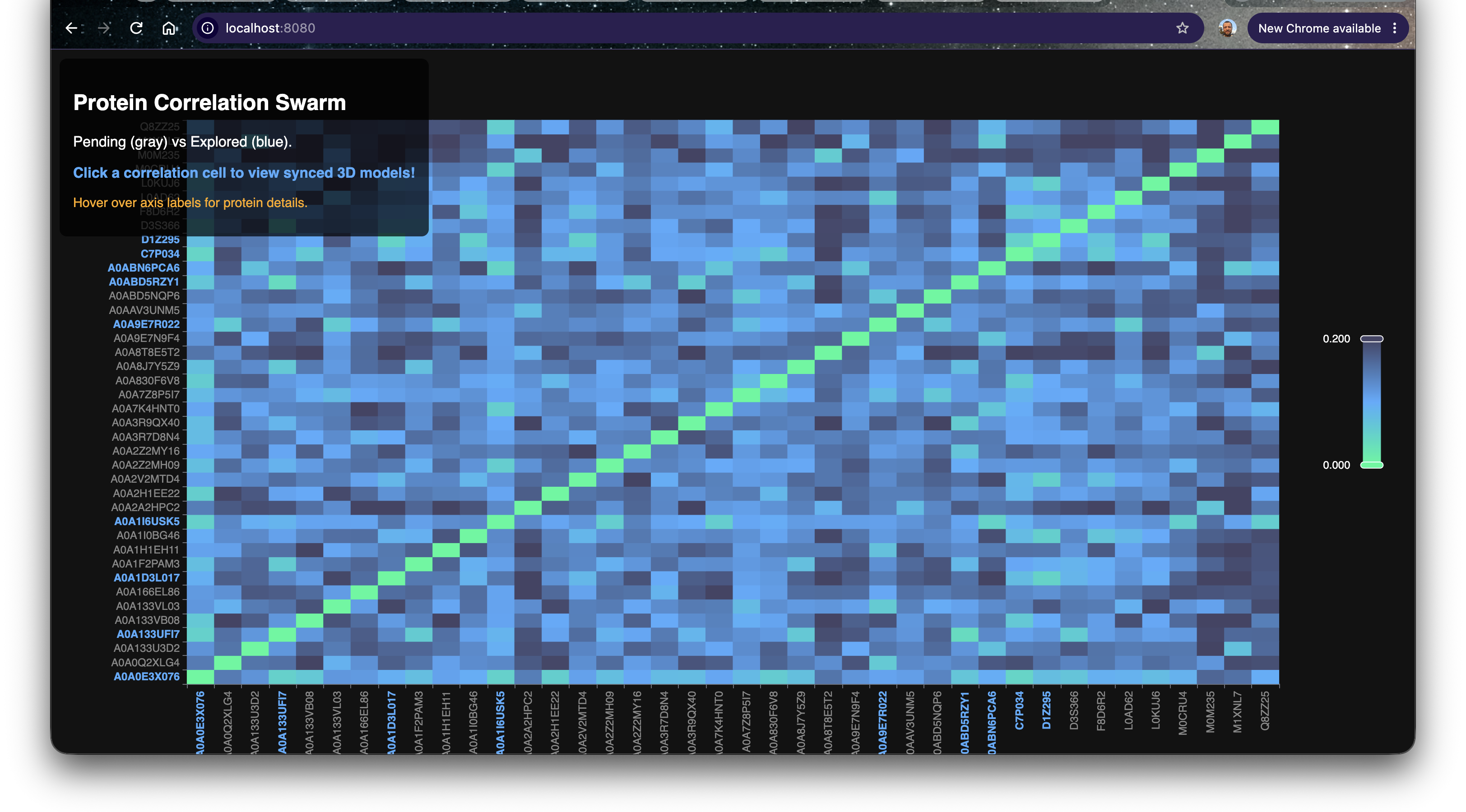
This ECharts-powered matrix maps every single organism in our current batch against each other. The bright blue and cyan diagonal represents identical or highly homologous structural vectors, while the darker navy regions represent distant structural families.
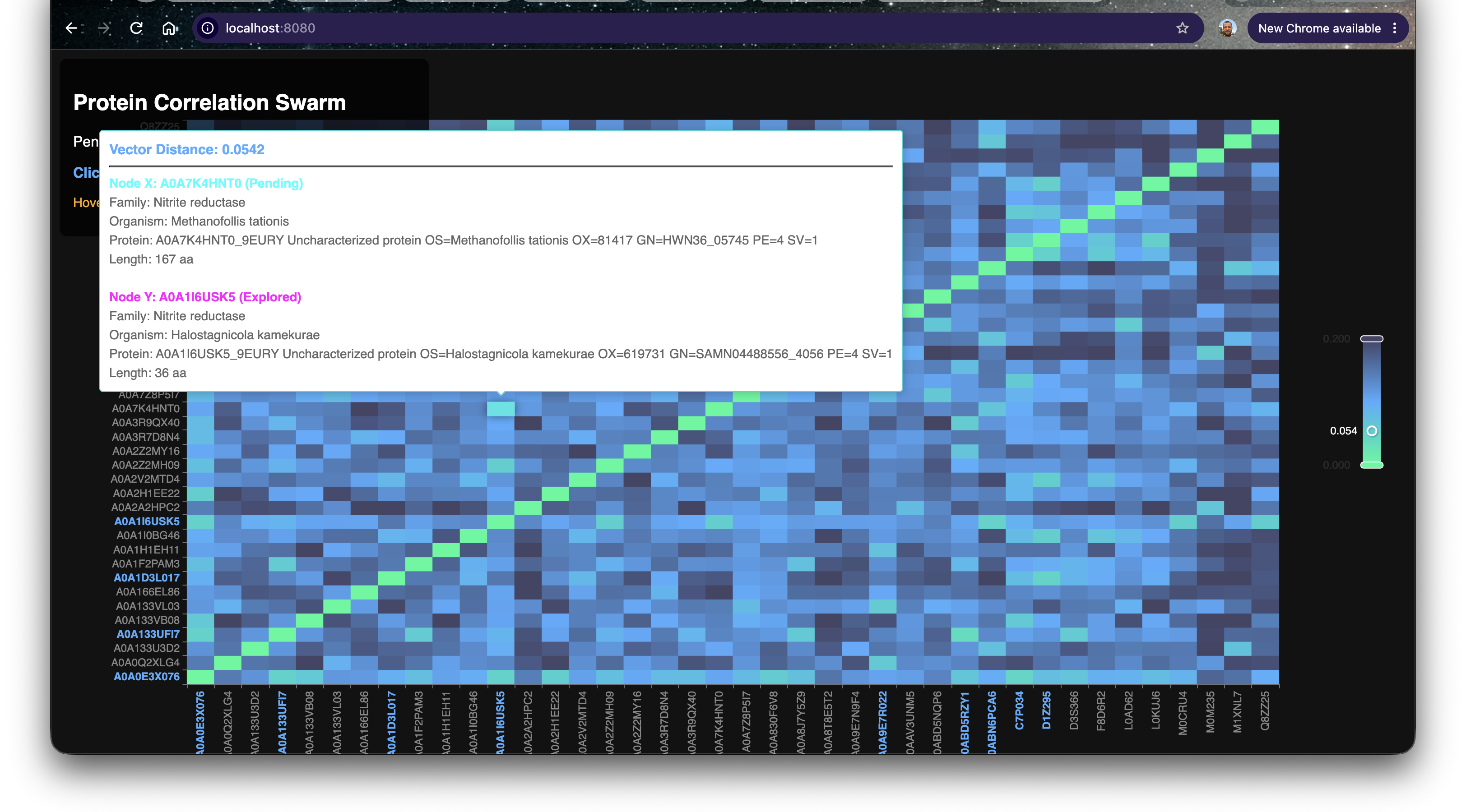
Because pg_bio is integrated directly with PostgreSQL, we don’t just see arbitrary IDs. Hovering over any cell instantly pulls rich taxonomic metadata directly from the database—including the Organism name, Protein Family, and sequence length—allowing us to quickly identify what we are looking at before we load the 3D models.
The Confidence Crisis: AlphaFold vs ESMFold pLDDT
One of the biggest challenges when exploring the Dark Proteome is hallucination. When we fold an uncharacterized sequence locally using bio_fold_sequence(), how do we know if the resulting 3D structure is biologically sound, or just an AI hallucination?
We solve this by coloring the 3D models by their pLDDT Confidence Score.
However, we ran into a math translation issue: AlphaFold stores pLDDT in the PDB B-factor column on a scale of 0.0 to 100.0. ESMFold stores it as a fraction from 0.0 to 1.0. We updated our 3Dmol.js integration with a custom mathematical normalizer that seamlessly translates both formats into the standard biological confidence gradient!
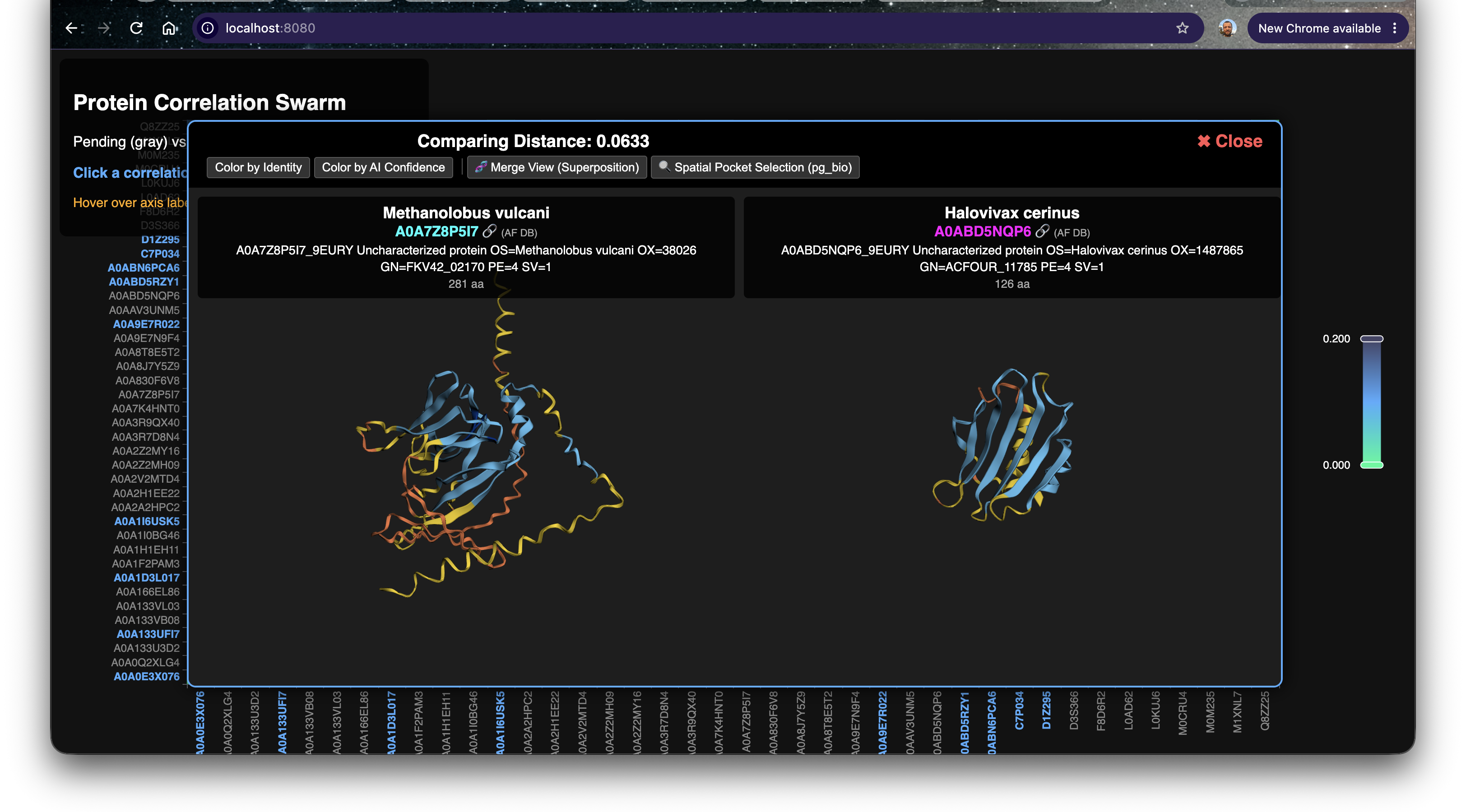
Notice the structural divergence here (Distance: 0.0633): The core beta-sheets (Blue) are highly confident predictions, but the surrounding intrinsically disordered loops (Yellow/Orange) vary wildly between the two organisms.
Finding a Perfect Match
As we scrolled through the heatmap, we spotted a pure cyan cell off the main diagonal. Two completely distinct organism entries yielded a vector distance of 0.0000.
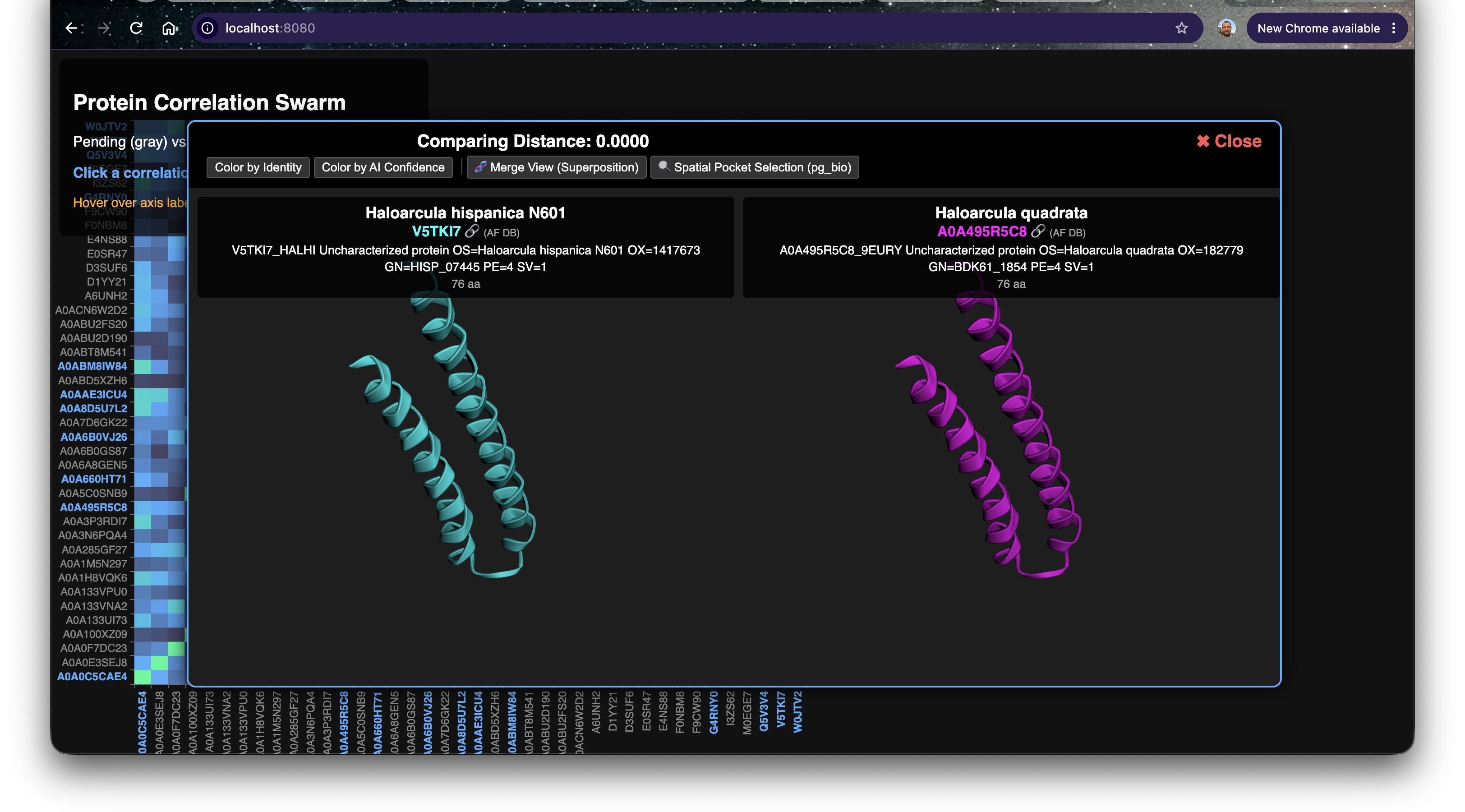
Let’s look at the metadata for this perfect correlation:
| Protein Variant | Family | Organism | Vector Distance | Length |
|---|---|---|---|---|
| Bait (Y) | Uncharacterized | Haloarcula hispanica N601 (V5TKI7) | 0.0000 (Base) | 76 aa |
| Discovery (X) | Uncharacterized | Haloarcula quadrata (A0A495R5C8) | 0.0000 | 76 aa |
Both of these are uncharacterized proteins from Haloarcula, a genus of highly halophilic Archaea that thrive in saturated salt lakes. Let’s validate the math by rendering the local ESMFold predictions generated by pg_bio right here in the browser.
The Horizon: Future Research Ideas
Visualizing vector distances unlocks a completely new paradigm for identifying structural orthologs that would be invisible to traditional sequence alignments like BLAST.
- Extreme Halophile Engineering: The perfect structural match of these helices across Haloarcula species suggests this specific geometry is hyper-stable in saturating salt concentrations. This motif could be extracted and fused to industrial enzymes to prevent them from denaturing in high-salinity bioreactors.
- Vector-Assisted Clustering: Now that we have a visual matrix of the distances, our next step will be to automatically extract the sub-clusters from the heatmap and run automated Z-Order spatial cavity searches to find out exactly why these structures are conserved.
Stay tuned as the swarm continues to dig deeper!
